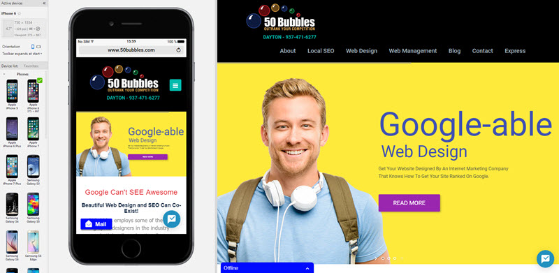
Very often we let our web developer handle the conversion of a website to its mobile-friendly counterpart but sometimes that isn't enough. There are some considerations that may affect how your responsive website looks and that is best handled by the website designer before the project is handed off to the development team.
There are several considerations when creating a mobile website. In almost all cases, the responsive version of a website is simply a reorganization of the content to look acceptible on a smaller, narrower screen. But should you simple accept the default standards? Consider this:
-
Is your website content heavy?
If so, will your mobile visitors want to read all that text? Consider your own habits when looking at sites on your phone. You thumb scroll and scan. How much are you actually reading? You may want to reduce the amount of verbiage that ends up on the phone screen or figure out a way to allow the visitor to get very quickly ONLY to the content that matters to him.
-
Don't think because your website is fast that it will be fast on a phone.
When you're sitting on your PC at home and looking at your website, it loads up great! My Spectrum account is 200 mbps!. I don't have the same luxury on a phone. My website on a phone will not be as fast as it is on a PC with a broadband connection. Ignoring this is a common mistake. Graphic heavy webpages that are not optimized for speed will actually be penalized in Google search. In some cases, we have two different sets of content with the same message. Which one shows is determined by the device.
-
Design for function
How you interact on a PC with a mouse is a LOT different than scrolling and selecting with your thumb. You have to make sure your website work with visitors on a phone in a very simple fashion. Links need to be thumb friendly. Phone numbers should be clickable. Address should be linked to the Google MAPS so the visitor can pull that up easily and navigate to your office.
Some helpful tools for checking your mobile site:
This browser is intended for PC use. When you browse to any website it will show you the desktop version and the mobile version of the website. You can even select different phones to see if the design works for a wide variety of phone formats. I've found Blisk to be indespensable for checking how my sites look on mobile devices. It's a great way for you to check your own site. (the free version limits the amount of time you can use the browser).
TEST YOUR SITE TO SEE IF IT'S RESPONSIVE
Google provides a mobile friendly test that will allow you to determine if you pass their standards. If you don't, you really need to upgrade your site. Probably more than half of your traffic is via smartphone and Google will penalize your search results if you site doesn't pass this test:
Google Mobile Friendly Test Site
FIND A GOOD MOBILE WEB DESIGN PERSON
Here is our Mobile Web Designer In Dayton Ohio - Furrey Marketing